Billing Explorer
Overview
Billing Explorer helps you create filtered reports to analyze and manage cloud costs and usage across multiple cloud providers over time. You can view your historical multi-cloud costs, group them by different dimensions, and apply filters such as Cloud Accounts, Regions, Services, Product Families, Tags, Charge Types, Teams, Departments, or any custom dimension you define.
The tool provides key metrics, including:
- Historical and Forecasted costs
- Usage and cost trends
- Month-over-month comparisons
- Savings opportunities
- Anomalies and cost spikes
- AI-generated cost explanations
Billing Explorer also includes a table view for exploring resources and drilling down into specific cost dimensions. For example, you can group by Accounts, click on a specific Account, and then drill down from Services to an individual resource to see exactly what it is being charged for.
Teams often create multiple reports with custom dimensions, such as Teams (Engineering, Product, etc.), Environments (Production, Development, Staging, etc.), and other relevant categories.
Budgets and alerts can be applied to each report. Once a report is created, Cloudchipr automates monitoring and communication. It alerts teams when budgets are exceeded, anomalies are detected, or regular updates are needed. AI-powered explanations are included in periodic reports, reducing the need for manual cost tracking and enabling proactive cost management.
Cloudchipr makes it fast and straightforward to manage multi-cloud bills, budgets, and alerts with just a few clicks.
Billing Explorer Reports
You can create a custom report in two ways:
- Customize the settings of an existing report and save the configuration as a new report.
- Select Add Report from the left-side menu and modify it as needed.
Reports can be organized into folders and subfolders, which is useful for large organizations with multiple teams and departments.
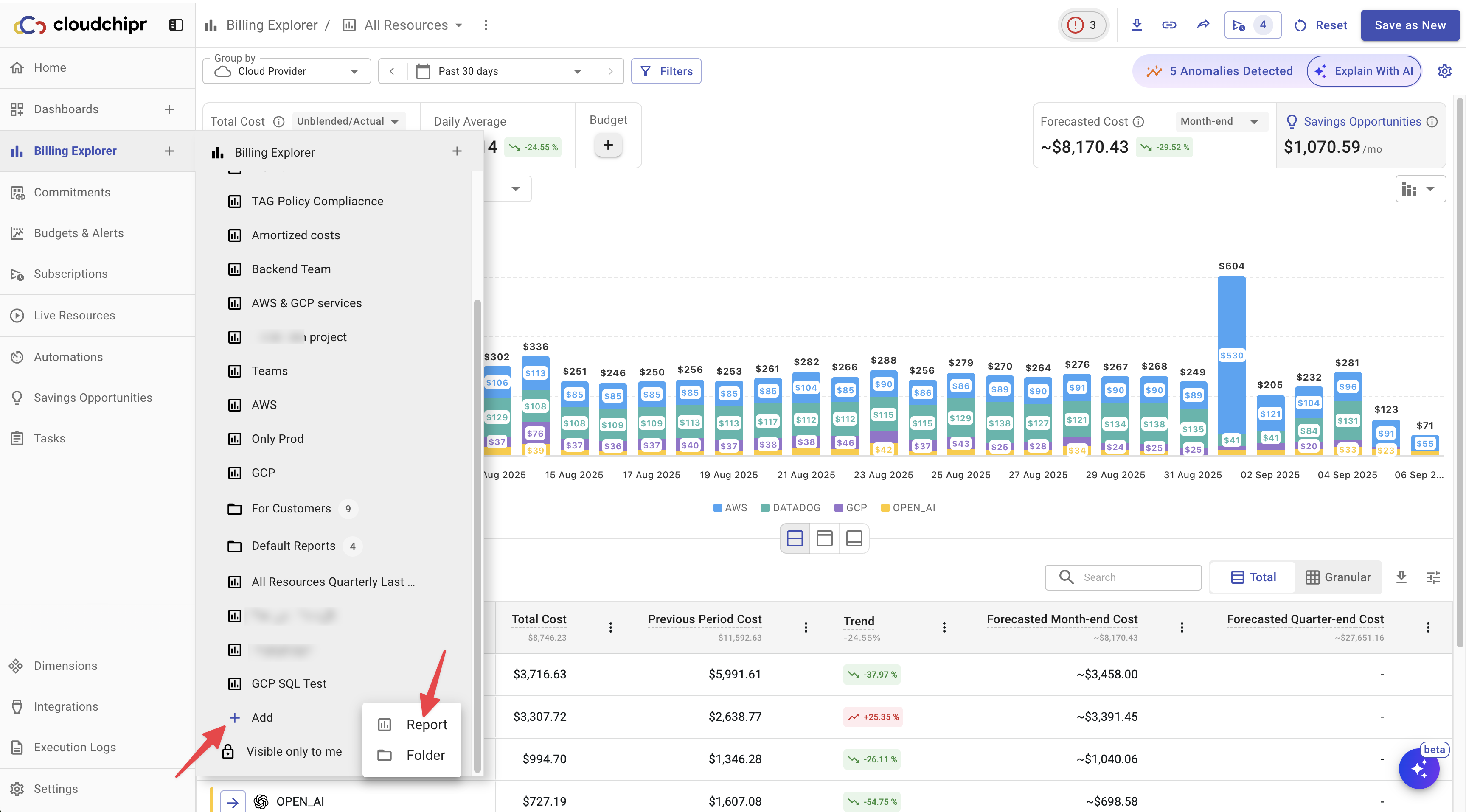
Billing Explorer stores your saved reports and displays them in the sidebar, under the Billing Explorer section, alongside the default view.
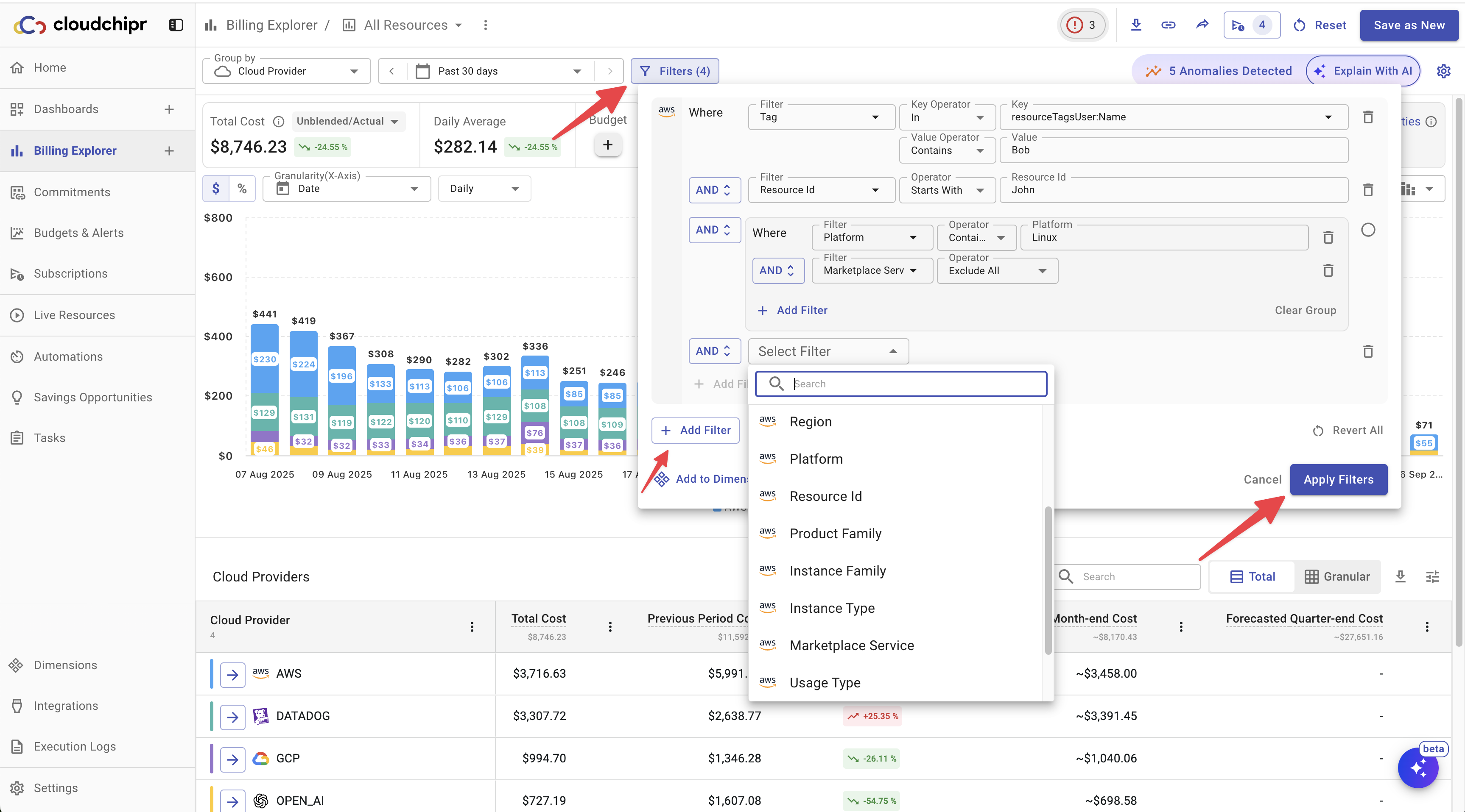
Filters
Filters in Billing Explorer can be very granular. You can start at a high level, such as Accounts or Tags, and drill down to specific resource IDs. Logical filter blocks allow you to combine multiple conditions, making it possible to create complex filtering rules tailored to your organization’s needs.
To apply filters to a report, click Filters, select your cloud provider, and choose the filters you want to apply.
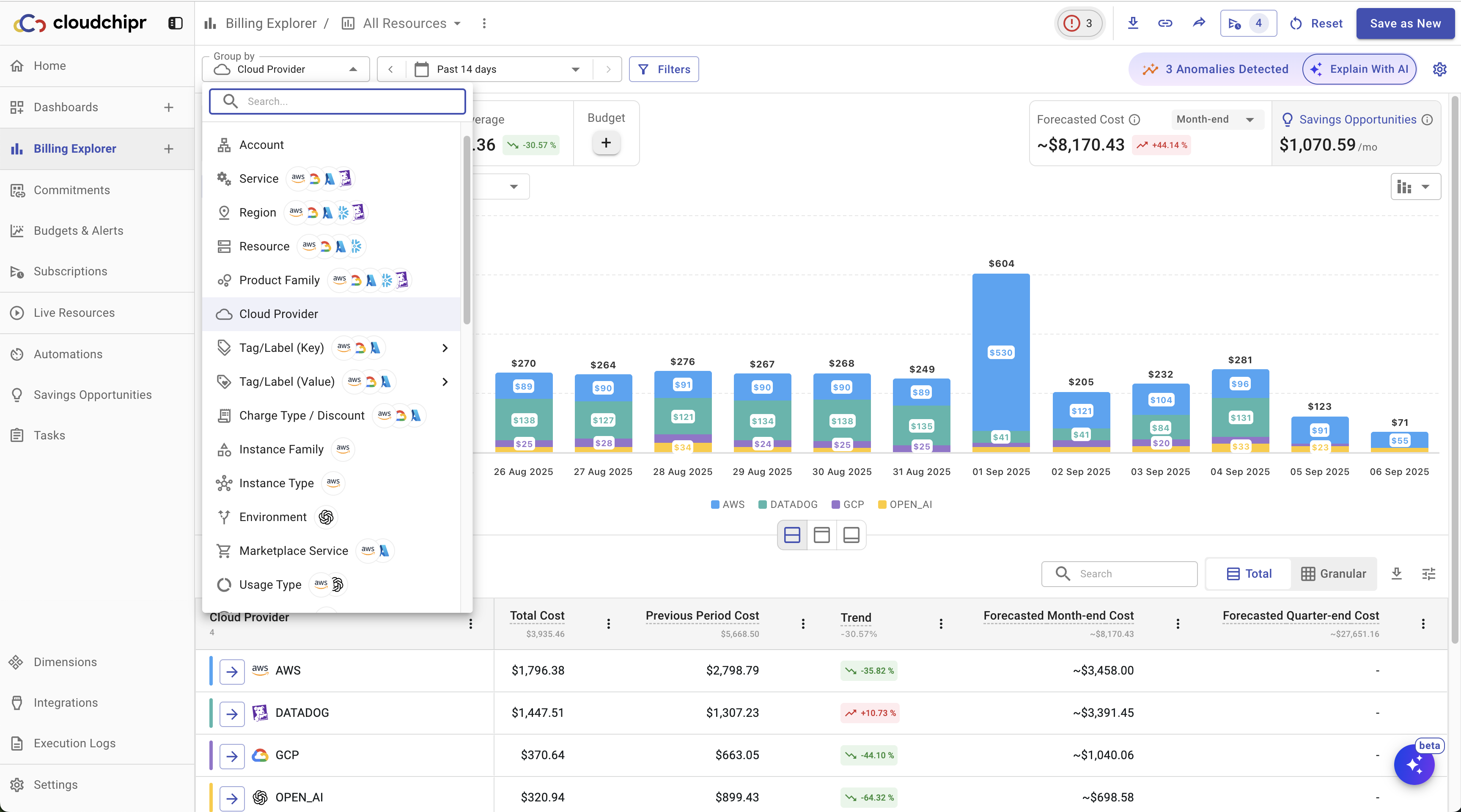
Group By
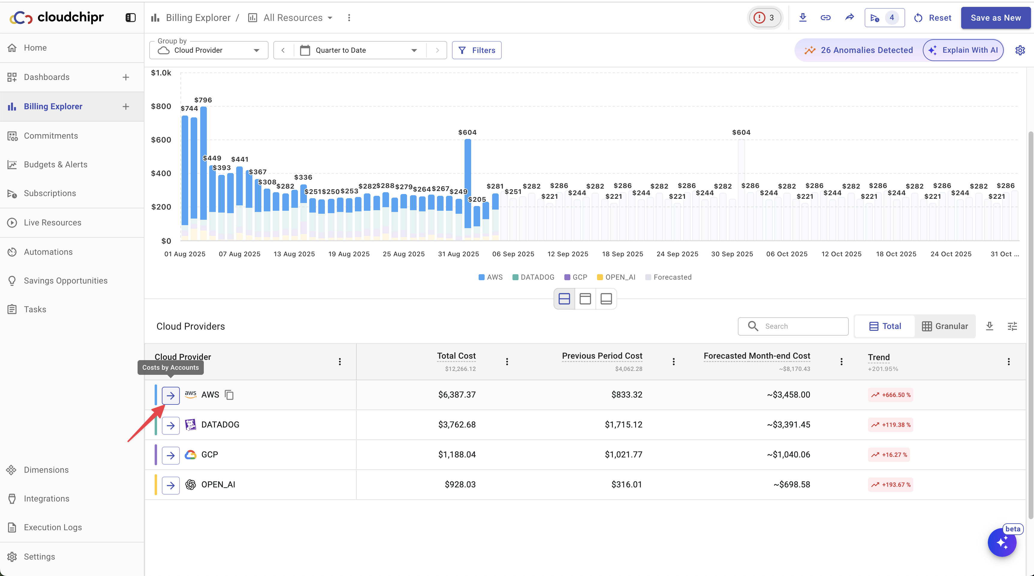
To view your cloud costs in a different dimension, select a new dimension from the "Group By" dropdown.
You can group by the following dimensions:
- Account
- Service
- Region
- Resource
- Product Family
- Cloud Provider
- Tag/Label (Key)
- Tag/Label (Value)
- Charge Type/Discount
- Instance Family
- Instance Type
- Environment
- Marketplace Services
- Usage Type
- Pricing Term
- Item Description
- Resource Group
- Platform
- Organization
- Dimensions
Additionally, some dimensions are specific to certain cloud providers. For example:
- Tag/Label: available for AWS and GCP.
- Discount: available for GCP.
- Charge Type: available for AWS and Azure.
Date Picker
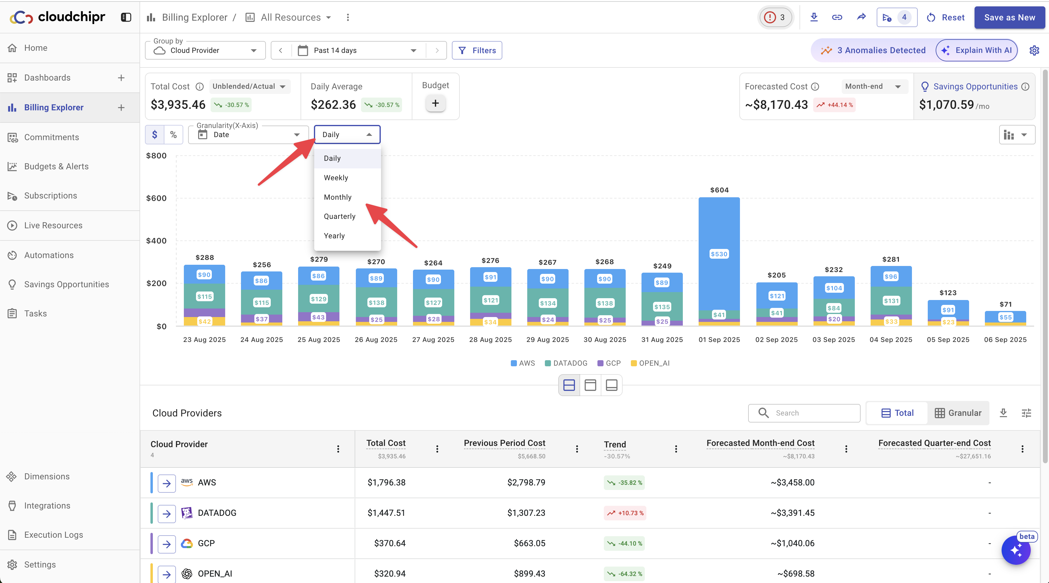
Set the Date Picker to your desired date range.
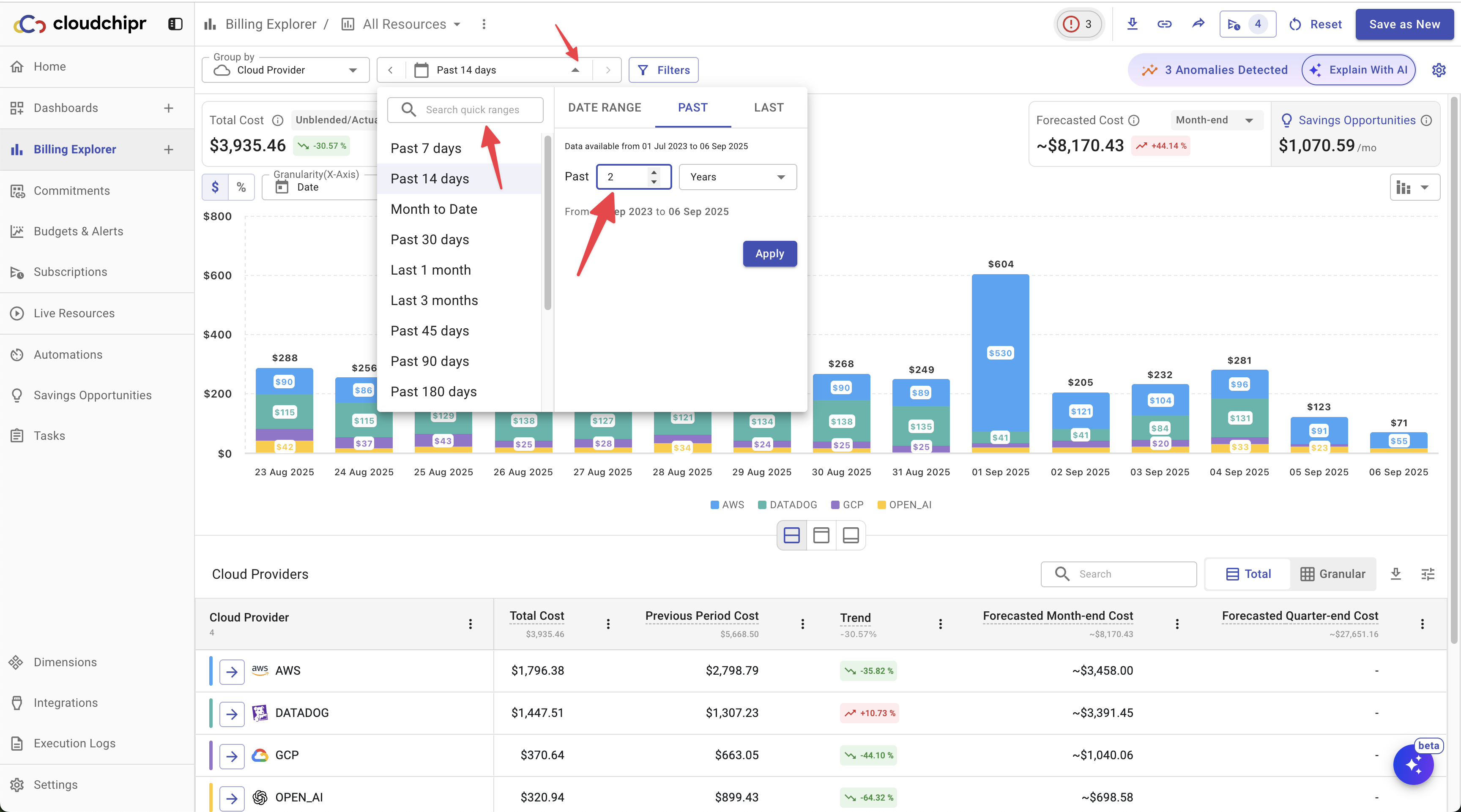
You can choose to view your cost data at yearly, quarterly, monthly, weekly, or daily levels of granularity.
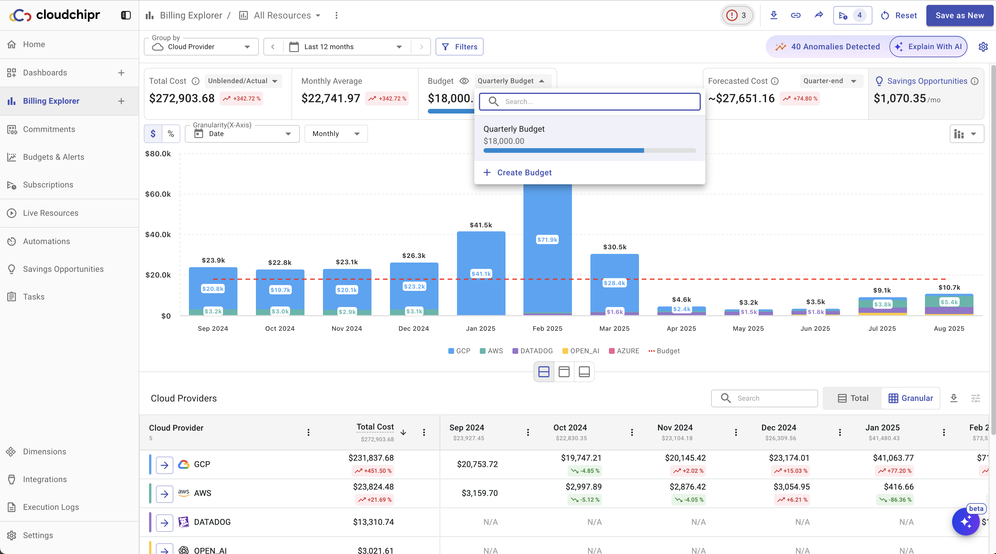
Cost Chart
Below is an explanation of the key numbers and metrics displayed in Billing Explorer reports:
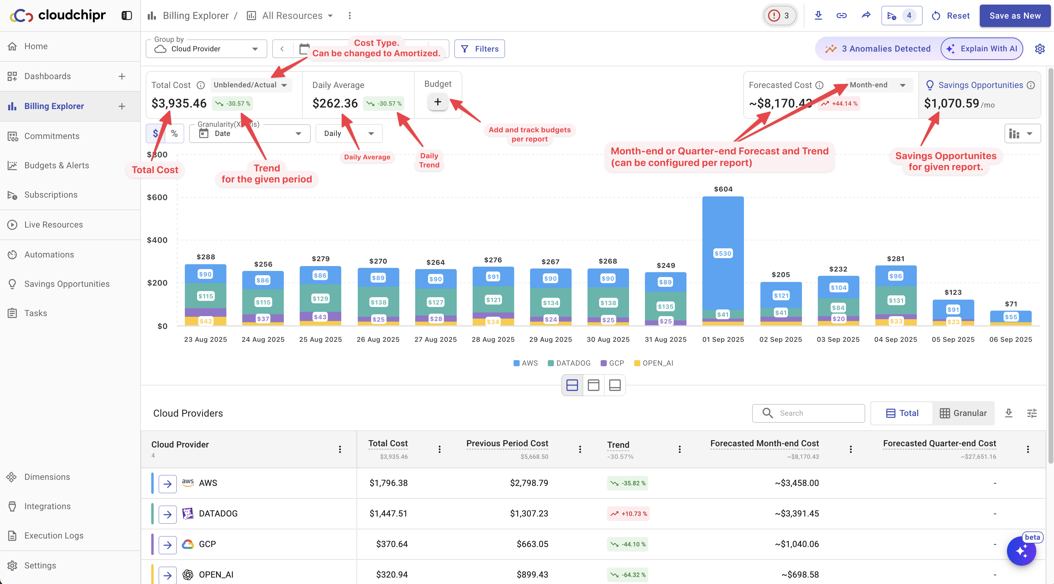
- Total Cost and Trend: Shows the total cost for the selected date range and the cost trend compared to the previous period. Example: If you are viewing AWS service costs for October, the trend will compare October against September. You can choose the cost type from the following options: Unblended/Actual, Amortized, Net Unblended, Net Amortized, or Blended.
- Daily, Weekly, Monthly, or Quarterly Average: Displays the average cost per day, week, month, or quarter, depending on the selected granularity.
- Budget: If a budget is set for the report, you’ll see the budget amount, a progress bar, and a budget line displayed on the chart.
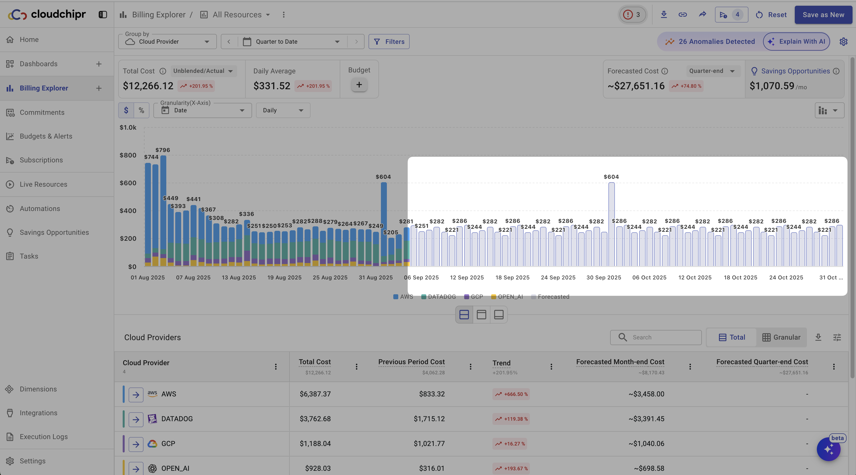
- Forecasted Cost: By default, the chart includes a forecast of the month-end cost. You can also choose to view forecasts for three- or six-month periods.
- Savings Opportunities: Displays the total monthly cost of all available recommendations.
In addition, the chart type can be changed, and Billing Explorer provides a zoom feature. You can select a specific area of the chart with your mouse to adjust the displayed date range.
Forecasting
Cloudchipr uses powerful analytical models to provide accurate and granular cost predictions for month-end, quarter-end, or year-end.
To activate forecasting on a chart:
- Set the date range to Month to Date or Quarter to Date.
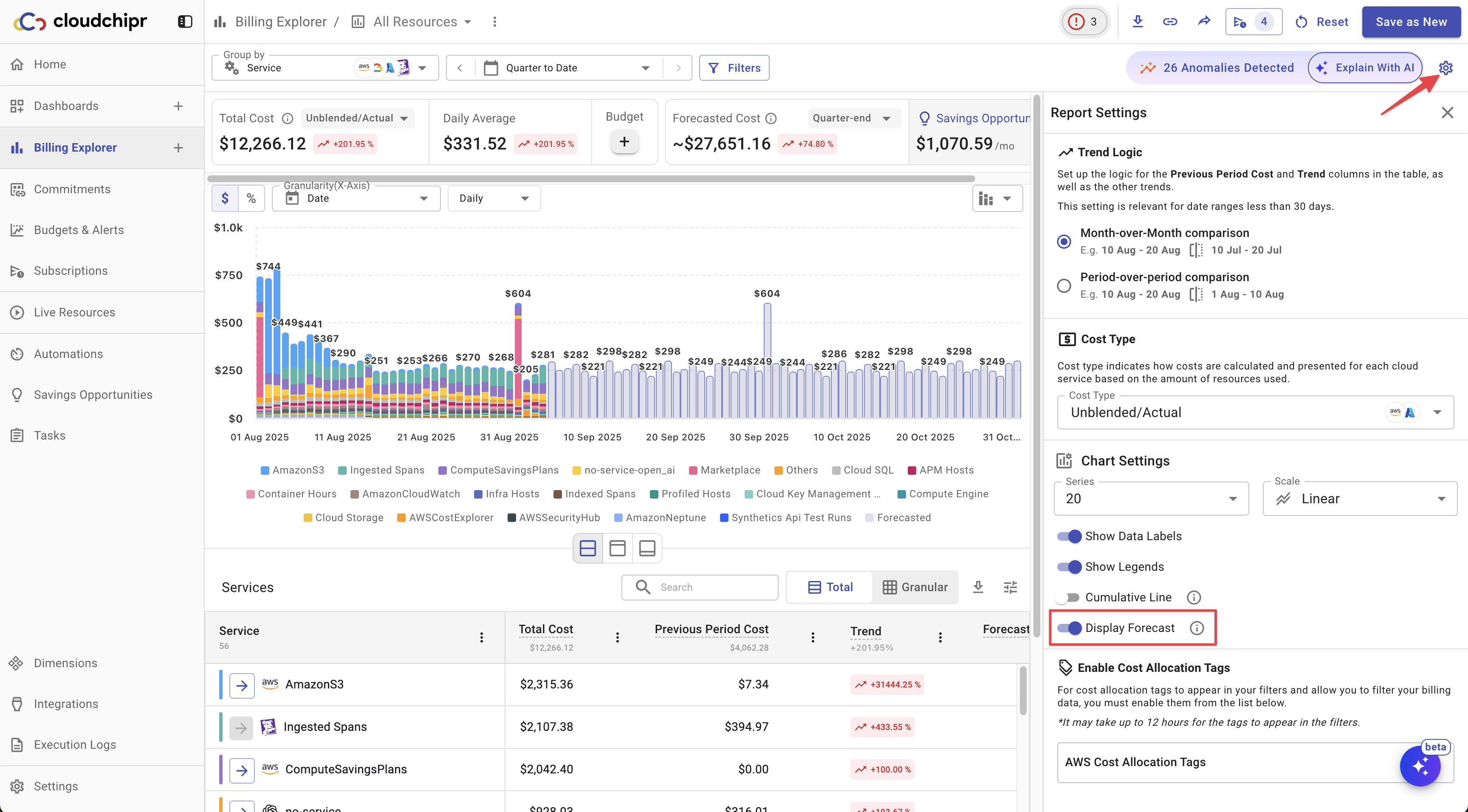
- Open the chart settings and enable the forecast option.
To enable the forecast option, click the Settings icon in the top-right corner, then enable the Display Forecast toggle in the settings panel.
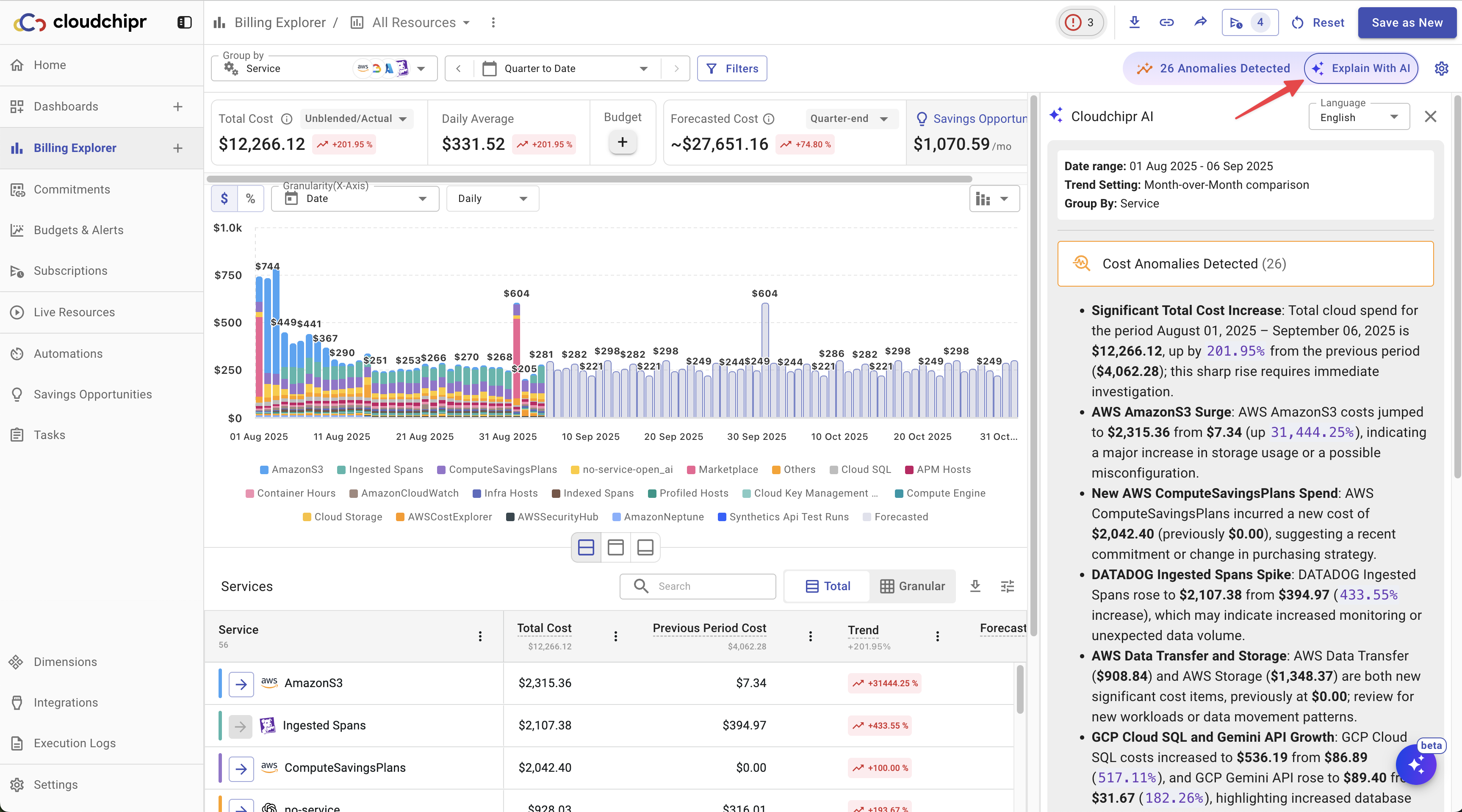
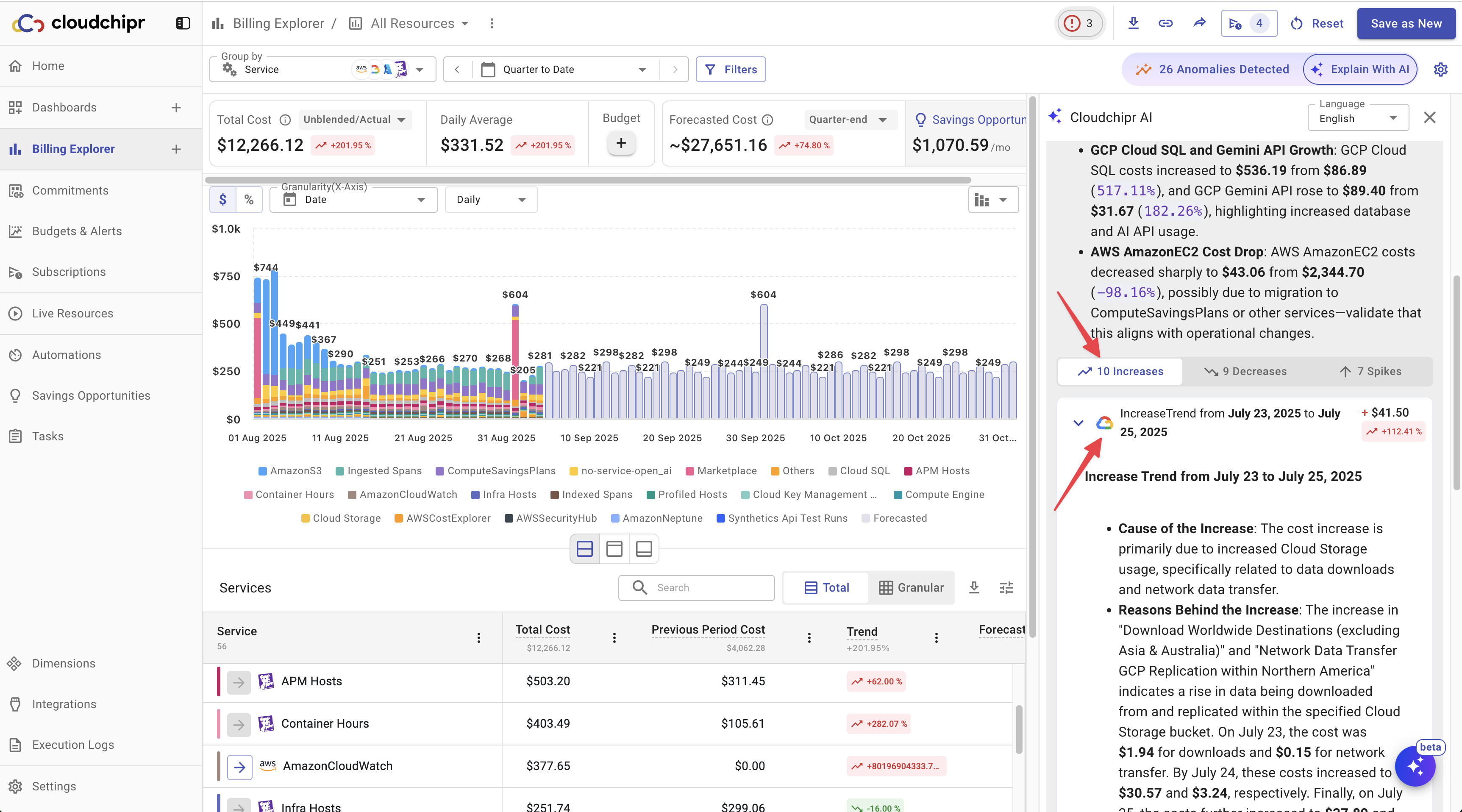
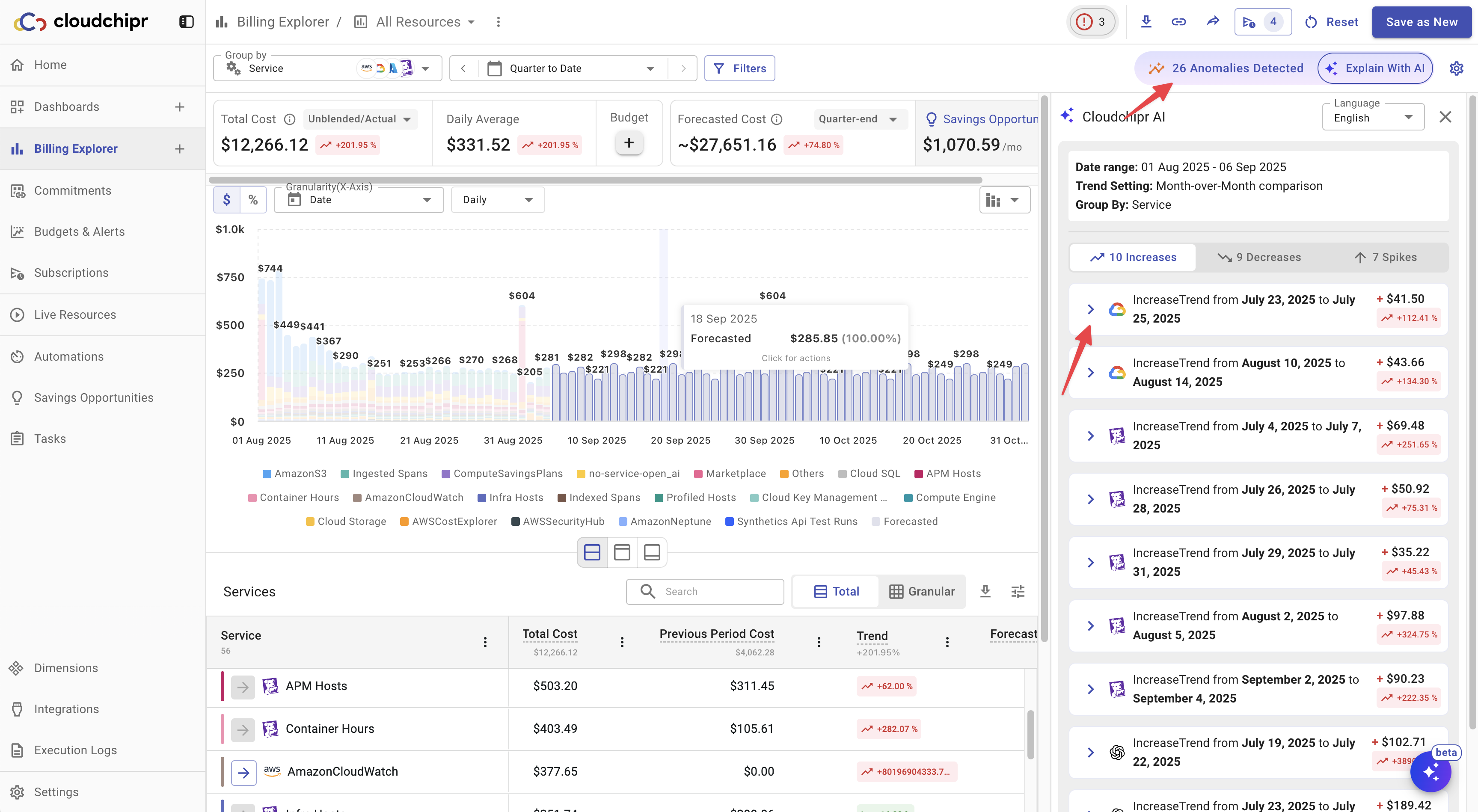
Explain with AI and Anomaly Detection
Cloudchipr AI analyzes your cost and usage data and explains it in plain language. It provides:
- A high-level summary of overall changes for the selected period.
- Detailed explanations for each spike and anomaly, including likely drivers.
Click on the Explain With AI button to get a high-level summary of overall changes
Scroll down to view Cost Increases, Decreases, and Spikes. Click on a specific event to see a detailed explanation of what happened.
In the example screenshot below, Cloudchipr identified a cost spike in network traffic and explained in detail which resources caused the increase.
To view only anomalies, click the Anomalies Detected button. This displays a list of all anomalies identified by the AI agent. You can then select any anomaly to see a detailed explanation.
Cost Table
The table below the chart provides detailed insights into your costs. It displays the Total Cost, Previous Period Cost, Forecasted Cost, and Trend for each dimension that your report is grouped by.
You can drill down further by clicking specific data points within the table. This allows you to analyze costs at a more granular level—for example, breaking down traffic and compute costs for a virtual machine.
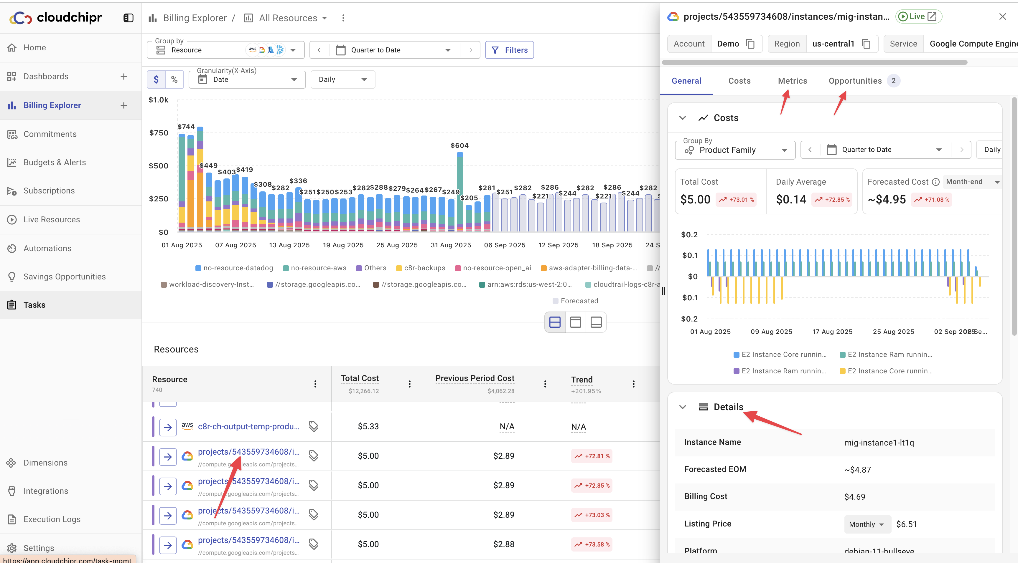
All resources in the table are clickable. Selecting a resource reveals additional details, including usage metrics, savings opportunities, tags, and other associated data.
Let's dive in.
For example, if you group costs by Cloud Providers, the table lists all your providers. Each row is clickable, allowing you to dive deeper and analyze the underlying resources driving those costs.
The breadcrumb shows your current navigation path, from the highest level down to the specific item you are viewing. It helps you understand the depth of your navigation and provides an easy way to move back to higher levels.
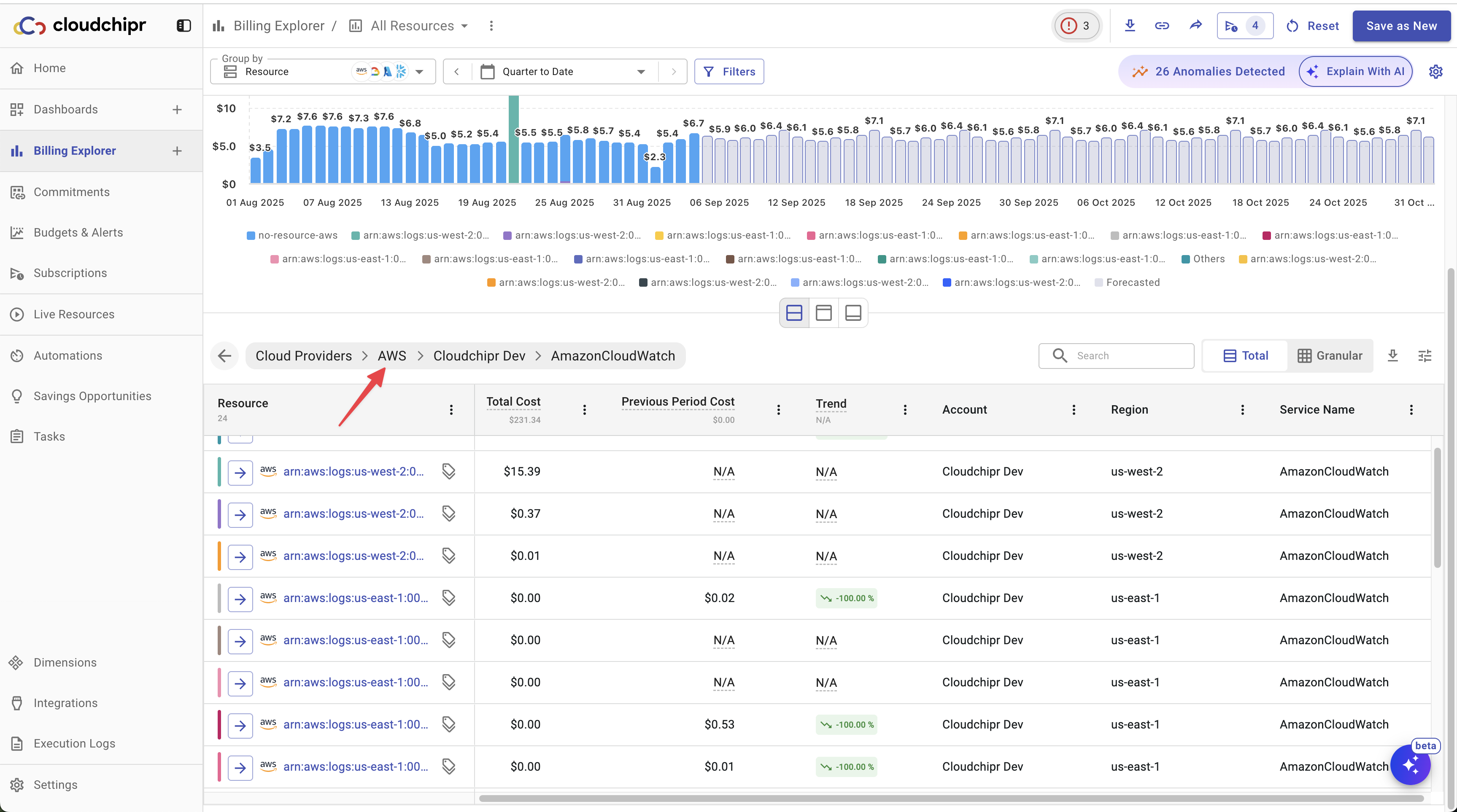
When grouped by Resources, you can click on a specific resource in the table to see all the resource details. This view includes everything from Tags to usage metrics and a list of all available Savings Opportunities for that resource.
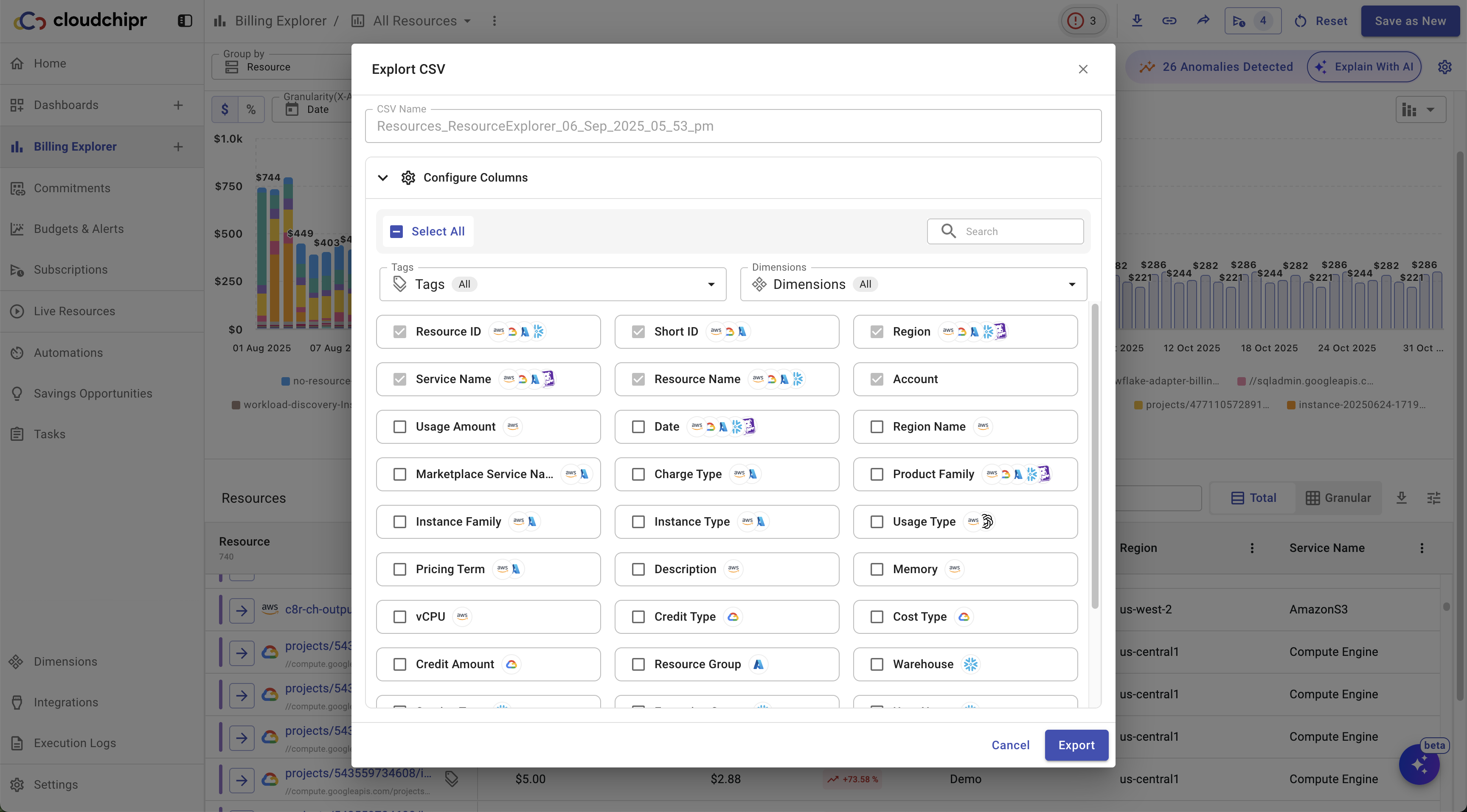
When grouped by Resources, you can export a detailed list of resources, including all available columns.
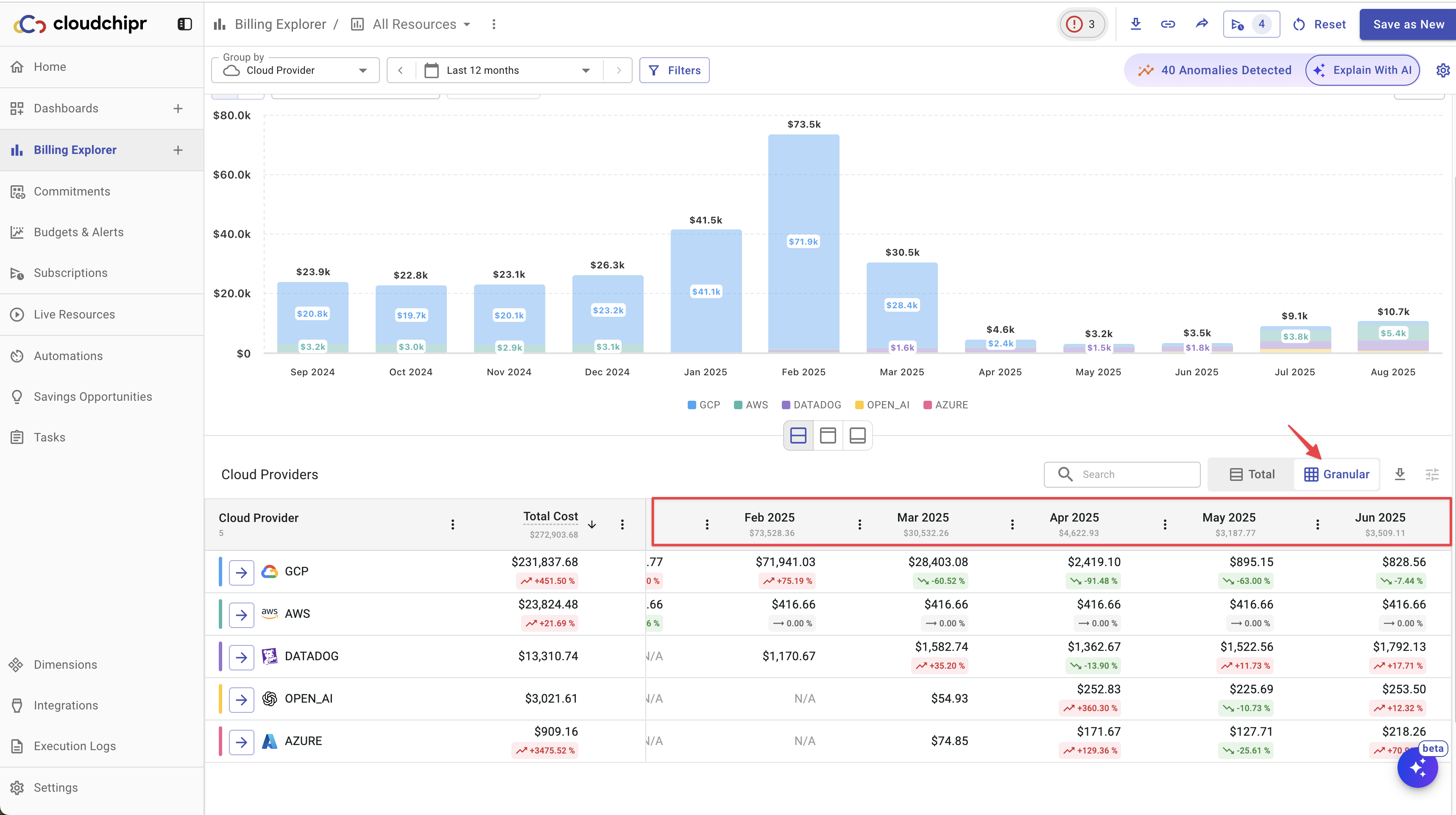
By clicking the Granular view button, you can display and download Month-over-Month or Day-over-Day costs and trends.
Set a Budget for the View
If a budget has been created for that specific view, you can easily access budget details. This includes viewing the budget amount, tracking budget progress, including the used and remaining balances, and seeing the budget line on the chart.
If no budget has been created for the specific view, you can click on Create Budget. This action will navigate you to the budget page, where the Select view field will already be pre-filled with the name of the view.
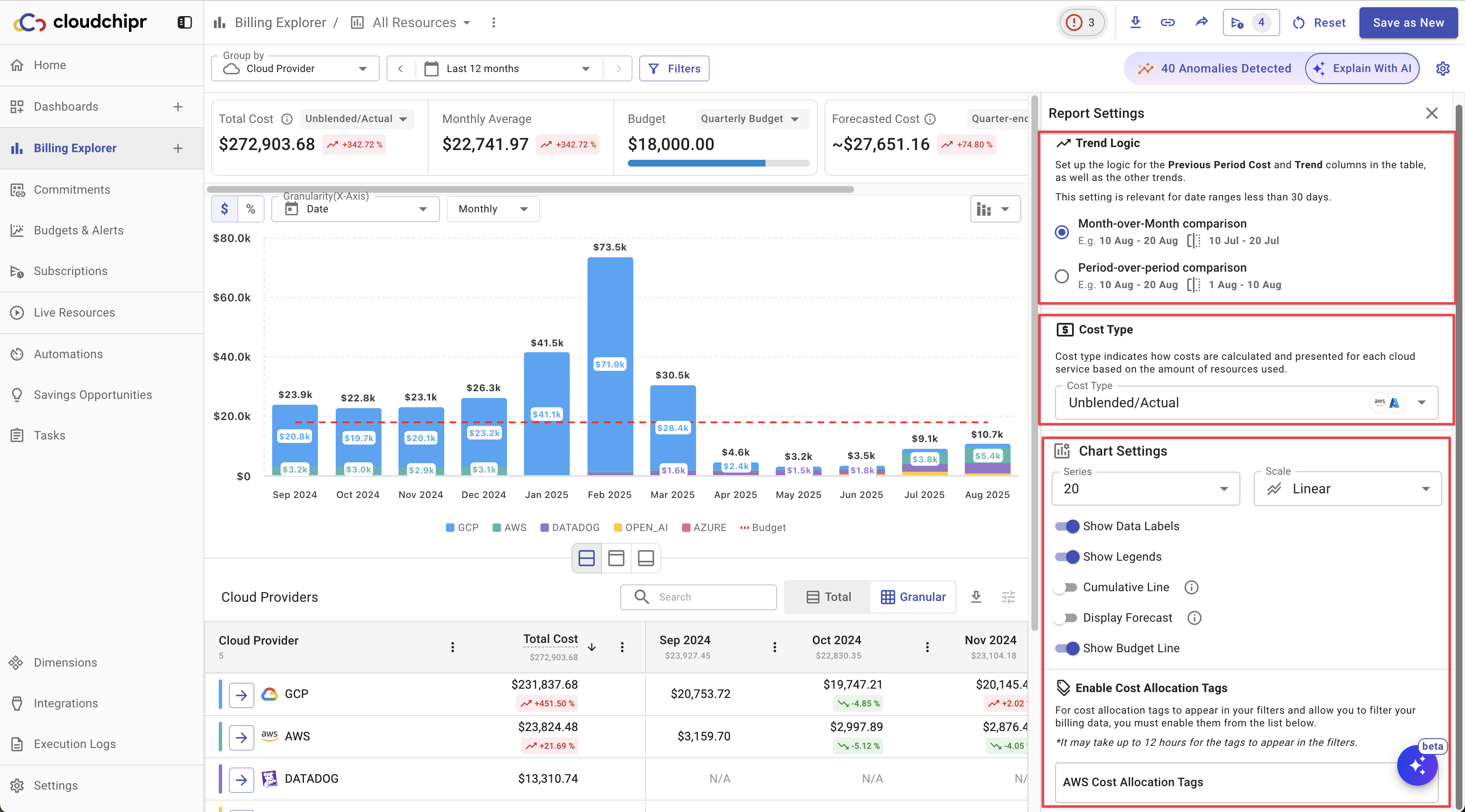
Report Settings
You can open the Report Settings by clicking the ⚙️ icon in the top-right corner and customize your reports as needed. The following settings are available:
- Trend Logic: Choose between Month-over-Month or Period-over-Period comparisons.
- When set to Month-over-Month, trends are calculated by comparing the current month with the previous month. Example: If the current date range is 10 Aug – 20 Aug, costs will be compared with 10 Jul – 20 Jul.
- When set to Period-over-Period, trends are calculated by comparing the current date range with the same range in the previous period. Example: If the current date range is 10 Aug – 20 Aug, costs will be compared with the immediately preceding period, e.g., 1 Aug – 10 Aug.
- Cost Type: Select how costs are calculated and presented. Options include Unblended/Actual (default), Amortized, Net Unblended, Net Amortized, or Blended.
- Chart Settings:
- Configure the number of series (20–35).
- Choose the scale (Linear or Logarithmic).
- Toggles for showing Data Labels, Legends, Cumulative Line, Forecast, and Budget Line on the
- Enable Cost Allocation Tags: Option to enable AWS cost allocation tags (may take up to 12 hours to apply).
Connecting Account
Upon connecting your cloud account, our system immediately scans it and displays all the resources you are currently utilizing.
Cloudchipr utilizes specific resources from each cloud platform to gather information. These resources include:
- AWS: The "Cost and Usage Report" feature.
- GCP: The "Billing Export" functionality.
- Azure: The "Cost Management" tool.
To ensure that you can view this data in the Resource Explorer tab, please verify that these resources are activated in your account.
Initially, the Billing Explorer displays all services in your account, and within 24 hours, it updates to include the costs generated by each service.
If you have connected your account and enabled the appropriate cost service but are still encountering errors, this could be due to several reasons:
- Cost and Usage Report Deletion: The report may have been manually deleted from your account.
- You don't have permissions to billing data
- Service Limitations: You might have encountered limitations specific to your cloud service. For example:
- AWS Limitation: AWS allows a maximum of 10 cost and usage reports. If you have reached this limit, you may experience issues.
Updated 11 months ago