Dashboards
Overview
Dashboards in Cloudchipr provide a centralized view of cloud cost and usage data. They help teams track spending, analyze cost breakdowns, monitor financial metrics, identify savings opportunities, and align costs with business goals. Dashboards can be tailored for FinOps teams, engineers, executives, and finance leaders to display the metrics most relevant to their work.
Create dashboards
Follow these steps to create and customize dashboards:
- In the navigation panel, select Dashboards.
- In the Dashboards section, click
Add Dashboard.
- You can create folders and organize dashboards within them for better management and easier navigation.
Additional options:
- Dashboards can be organized into folders for easier navigation.
- Visibility settings:
- Visible to everyone – shared with all workspace users.
- Visible only to me – private to the creator.
Dashboard Actions
Each dashboard includes actions for managing and sharing:
- Send – Share a dashboard with stakeholders via Slack or Email.
- Subscribe – Schedule automated, recurring delivery.
- Protect – Lock a dashboard to prevent changes or deletion.
- Move – Reorganize dashboards within folders.
- Duplicate – Create a copy of an existing dashboard.
- Set as Homepage – Select a dashboard as the first screen shown after login (each user can set their own).
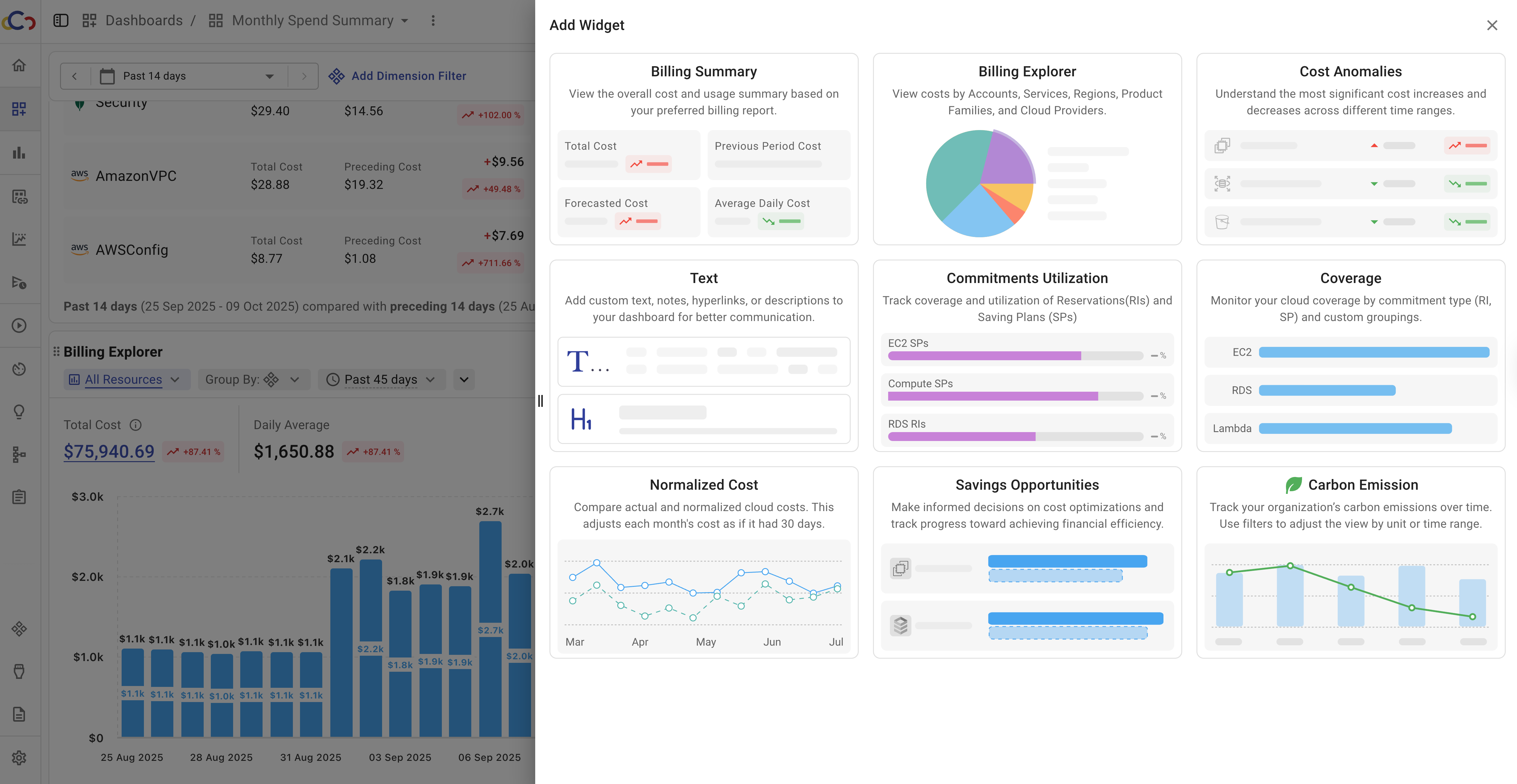
Dashboard Widgets
Dashboards support multiple widget types for displaying cost and usage data.
To add a widget:
- Click
Add Widget. - Select a widget type from the drawer.
- Configure the widget and click
Addto place it on the dashboard. - After adding, widgets can be duplicated, edited, or deleted.
Cloudchipr supports the following widget types.
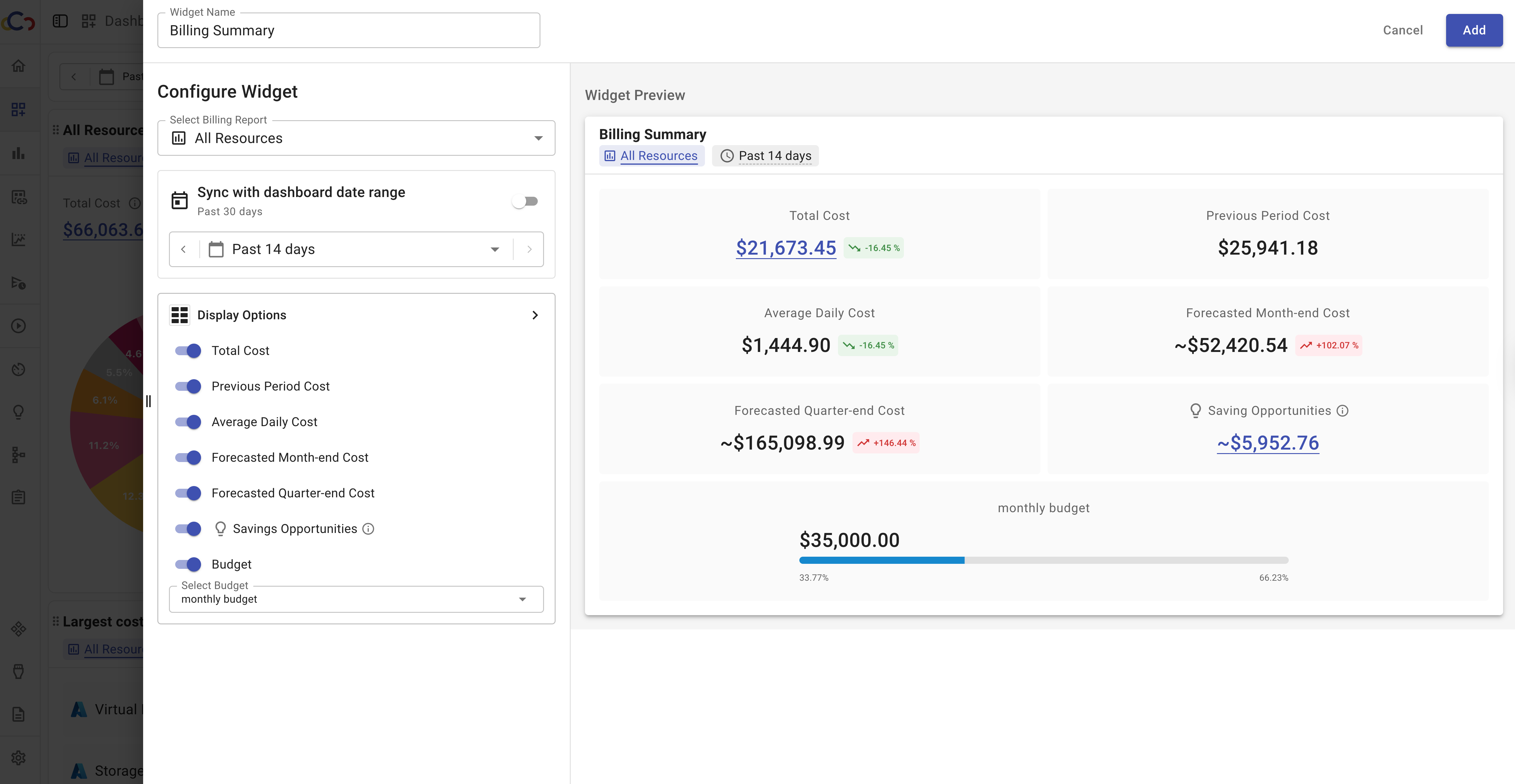
1. Billing Summary
The Billing Summary widget provides a high-level overview of your cloud costs, usage, and potential savings. It highlights the most important financial metrics in one place, making it especially useful for executives and finance stakeholders.
Key insights include:
- Total Cost
- Previous Period Cost
- Average Daily/Monthly Costs
- Forecasted Month-End/Quarter-End Costs
- Saving Opportunities
Configuration options:
- Select any period to analyze short-term or long-term trends.
- Choose which cost and usage metrics to display for maximum relevance.
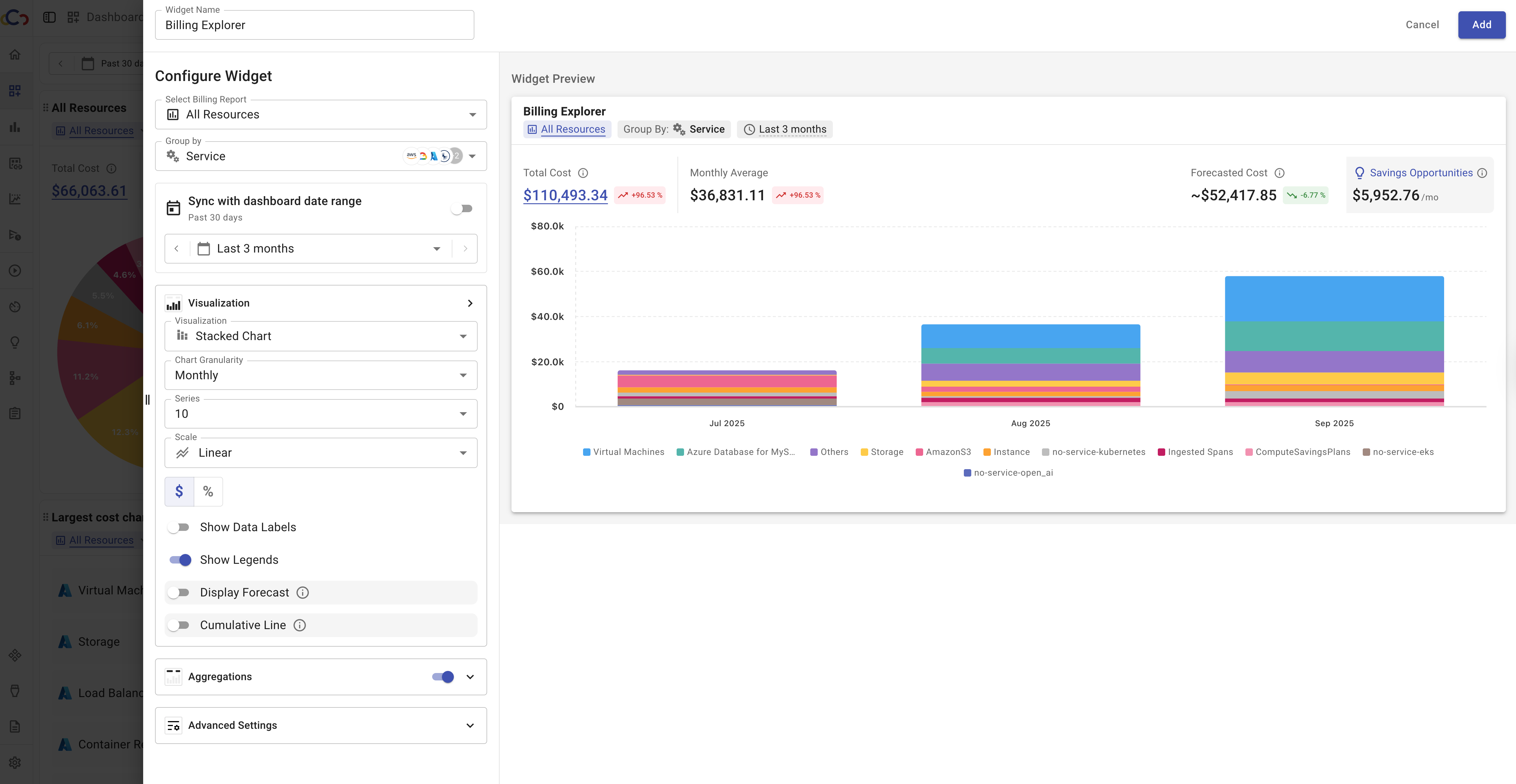
2. Billing Explorer
The Billing Explorer widget provides a flexible, interactive view of your cloud costs. It allows you to break down spending by different dimensions, visualize trends over time, and forecast future costs. This widget is useful for FinOps practitioners, engineers, and finance teams who need detailed visibility into cost drivers.
Configuration options:
- Group costs by multiple dimensions.
- Adjust the date range.
- Change visualization options (stacked chart, line chart, bar chart, pie chart, table or number).
- Select chart granularity (daily, weekly, or monthly).
- Choose the scale of the chart: linear for straightforward cost tracking, or logarithmic for analyzing values with large variations.
- Manage which aggregations to show on the chart (e.g., total cost, forecasted cost).
- Choose how forecasts are displayed (e.g., month-end or quarter-end projections).
- Enable trend comparison methods such as Month-over-Month or Period-over-Period.
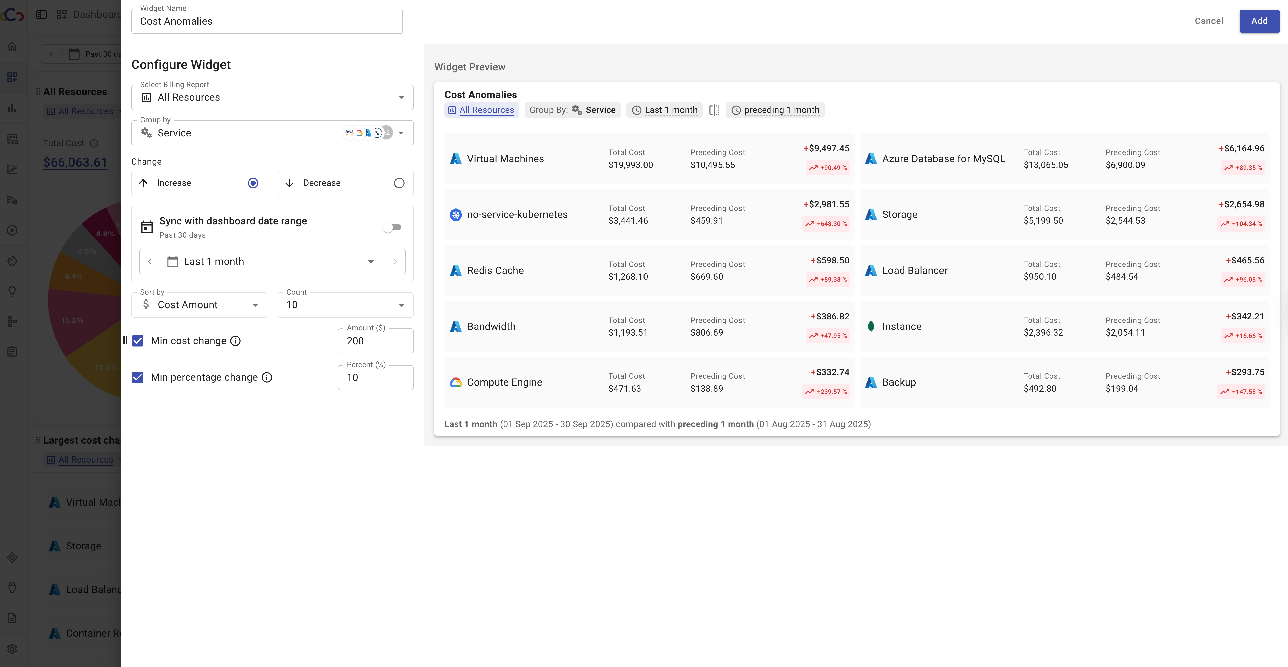
3. Cost Anomalies
The Cost Anomalies widget highlights significant changes in cloud costs across dimensions such as services, accounts, or product families. It helps you identify the largest increases and decreases in spending for a selected Billing Explorer report, making it easier to focus on the most impactful changes.
Configuration options:
- Choose the billing report to use as the data source for anomaly detection.
- Organize anomalies by dimensions such as service, account, or product family. For example, grouping by service will display cost changes at the service level.
- Select whether to display increases or decreases.
- Define the reporting period to analyze anomalies over a specific timeframe.
- Refine results by setting minimum change values:
- Min cost change ($): Show only anomalies where the absolute change in cost is greater than or equal to the specified dollar amount.
Example: If set to $500, only services with cost changes of $500 or more will be shown. - Min percentage change (%): Show only anomalies where the relative change is greater than or equal to the specified percentage.
Example: If set to 50%, only services with cost increases of 50% or higher will be shown.
Threshold filters can be applied individually or together. When both are applied, the widget displays only anomalies that meet both conditions.
- Min cost change ($): Show only anomalies where the absolute change in cost is greater than or equal to the specified dollar amount.
- Refine results by setting minimum change values:
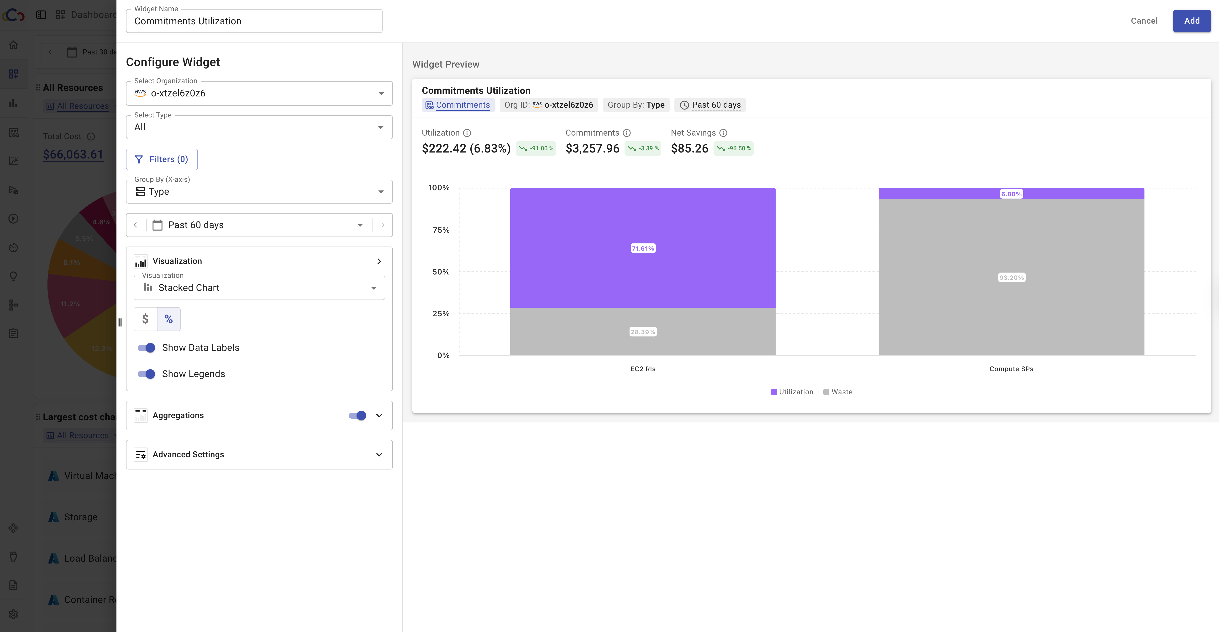
4. Commitments Utilization
The "Commitments Utilization" widget provides insights into how effectively you are using your commitments, such as Reserved Instances or Savings Plans. It highlights the ratio of consumed commitments compared to the total purchased amount, helping you understand whether you are maximizing the value of your prepaid or discounted commitments.
Configuration options:
- Select the type of commitments to display, whether RIs, SPs, or both.
- Group the data by resource type, account, region, or overall total.
- Filter results by organization if multiple organizations are enabled.
- Set the reporting period to view trends over time.
- Visualize the data using different chart types.
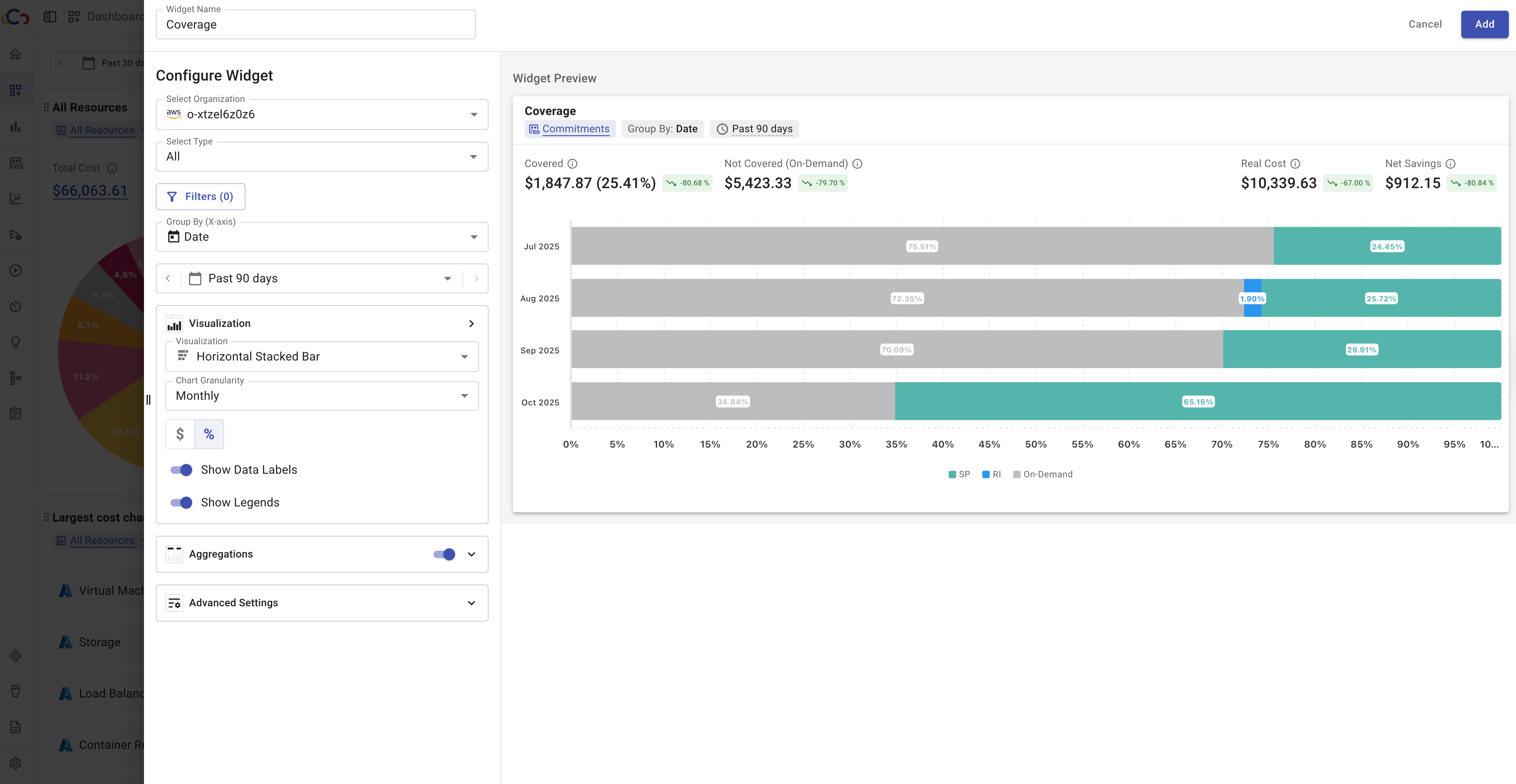
5. Coverage
The Coverage widget helps you understand how much of your usage is covered by commitments such as Reserved Instances (RIs) or Savings Plans (SPs). It shows the relationship between committed and uncommitted usage, making it easier to identify areas where additional commitments could reduce costs or where existing commitments may be underutilized.
Configuration options:
- Select the type of commitments to display, whether RIs, SPs, or both.
- Group the data by resource type, account, region, or overall total.
- Filter results by organization if multiple organizations are enabled.
- Define the reporting period to analyze historical trends.
- Visualize the data using different chart types.
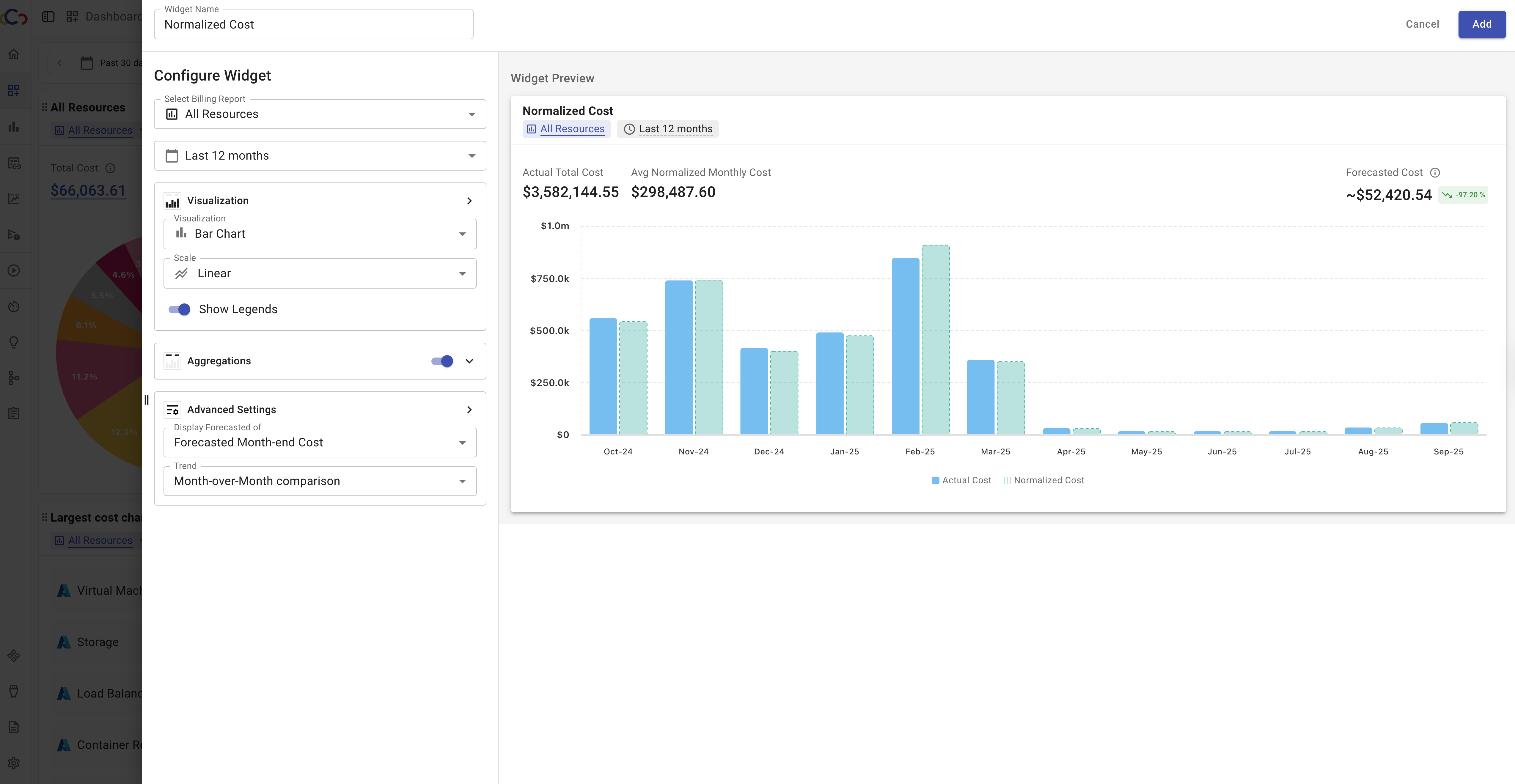
Normalized Cost
The Normalized Cost widget helps you compare monthly cloud costs more accurately by removing the bias of different month lengths. Instead of showing the raw monthly cost, it adjusts values so that each month is represented as if it had 30 days. This provides a clearer picture of your cost trends over time, avoiding misinterpretations (e.g., February appearing cheaper simply because it has fewer days). This widget allows you to view normalized costs alongside total costs for better comparison.
Configuration options:
- Select a billing report.
- Define the date range: last 3, 6, or 12 months.
- Visualize the data using different chart types.
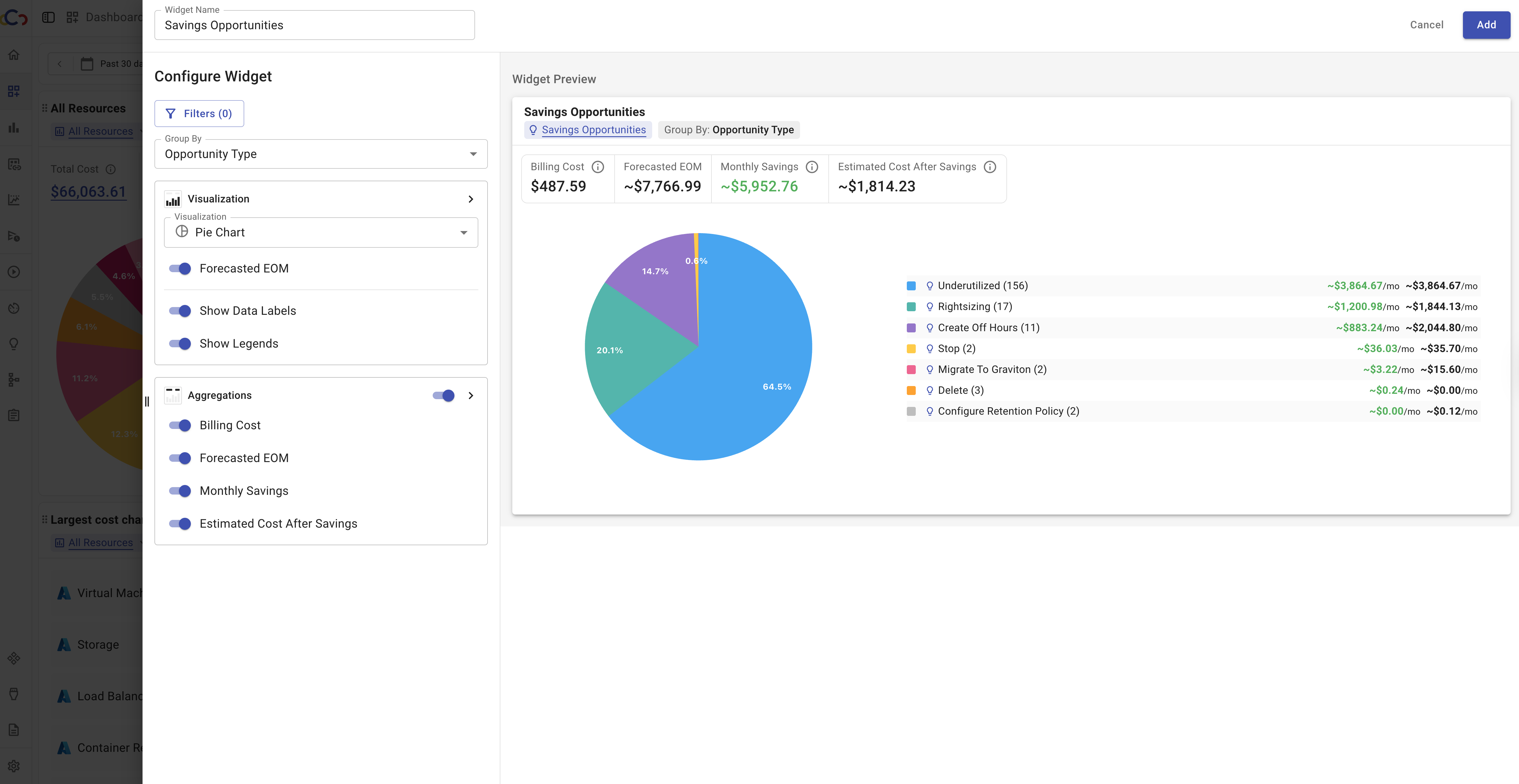
Savings Opportunities
The Savings Opportunities widget provides a visual way to track and prioritize potential cost-saving actions directly from your dashboard. Instead of relying only on table views in the Saving Opportunities page, this widget highlights impactful opportunities at a glance, making it easier to compare recommendations, monitor trends, and decide where to take action.
Configuration options:
- Apply filters to refine which opportunities are shown. By default, all opportunities are displayed. Filters include both Resource Explorer filters and additional opportunity-specific criteria such as recommended type, implementation effort, current and estimated monthly price, monthly savings, and more.
- Display opportunities individually or group them by criteria such as opportunity type, service, account, region, implementation effort, or other attributes.
- Choose how to present the data.
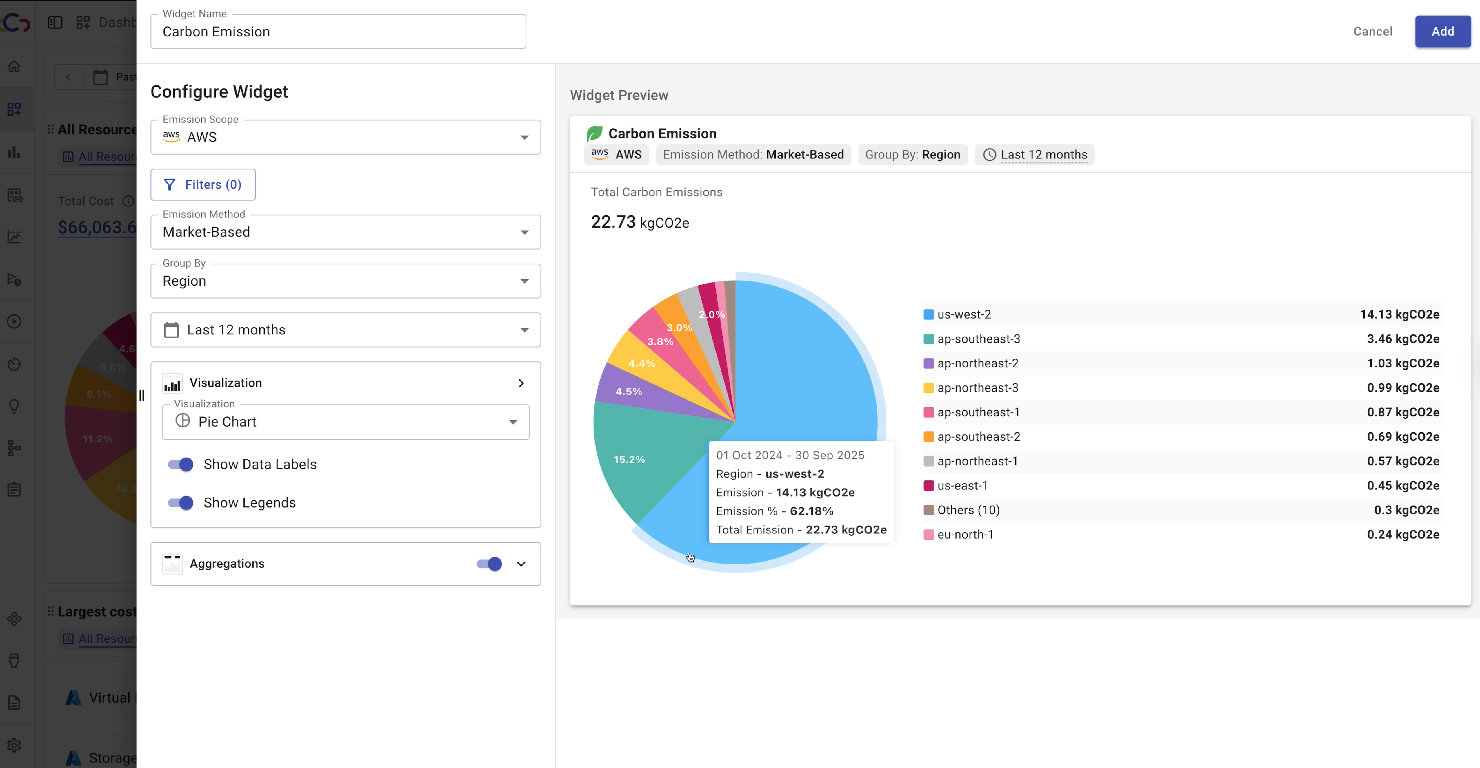
Carbon Emission
The Carbon Emission widget enables you to visualize and track your carbon footprint directly on the dashboard. It helps teams monitor sustainability efforts and showcase progress. The widget provides flexible configuration options, allowing users to analyze emissions across different scopes, providers, and calculation methods.
Configuration options:
- View emissions in a general context or focus on a specific cloud provider (AWS, GCP, Azure).
- Apply provider-specific filters to refine results.
- Toggle between Market-Based and Location-Based calculations.
- Display all emissions or focus on Scope 1, Scope 2, or Scope 3.
- Break down data by dimensions such as region, service, emission type, or cloud provider.
- Define the reporting period to analyze emissions over time.
- Choose how to present the data.
Text Widget
The Text Widget allows you to add custom text, notes, links, or descriptions directly to your dashboard. It can be used to provide context, share instructions, or highlight important information alongside other widgets.